

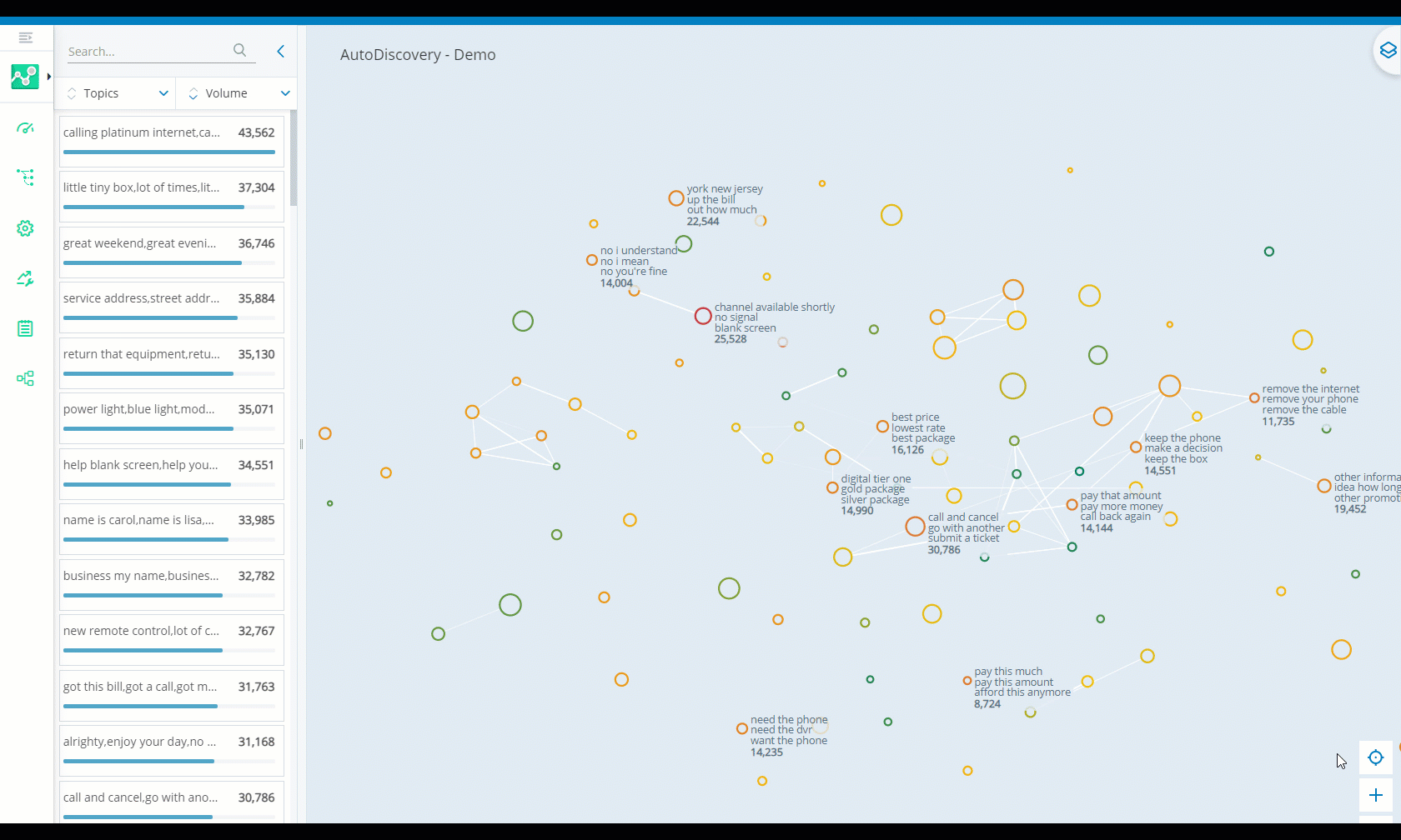
Use the AutoDiscovery map and metrics to investigate the suggested topics and phrases in your dataset. You can search, filter, and sort your data to identify trends and anomalies that may be of interest to you. The information you discover can help you edit or create new categories for your dataset. You can export your findings as a CSV file to review and share later.
Investigate Suggested Topics on the Map
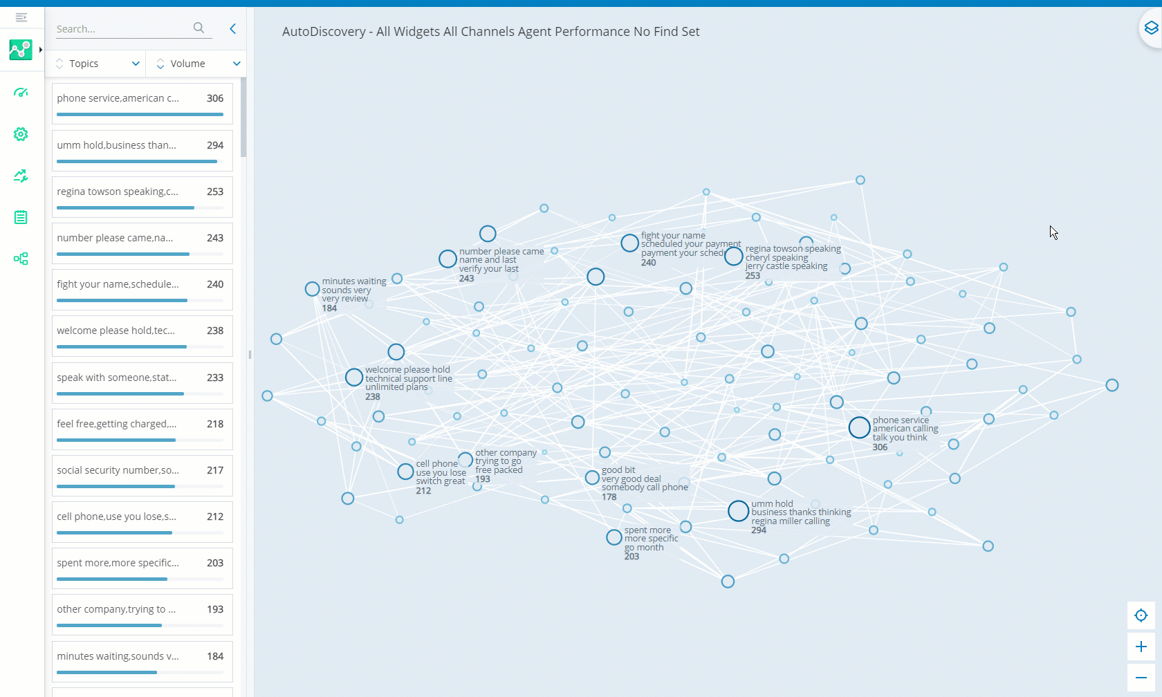
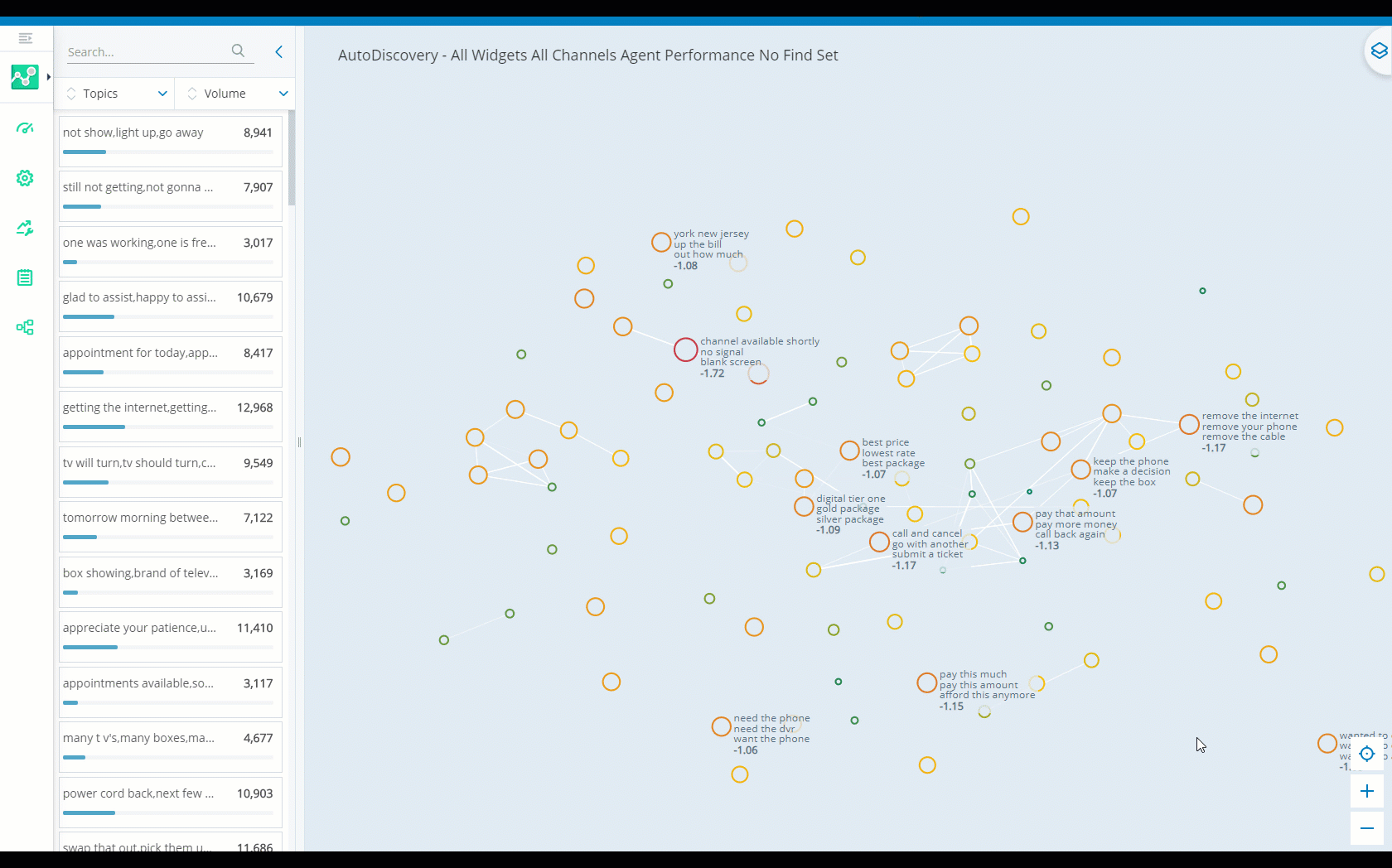
To investigate the map you can:
-
Zoom in and out or pan over the map to view topics and phrases.
-
Click on a topic that you are interested in. The map focuses on the topic and the topic statistics display in the Statistics panel.
-
Click into the topic on the map to view the phrases included in a topic. Proximity to the center of a topic indicates the frequency of that phrase within the topic.
Filter Your Data
You can filter your data by specific metrics or topics and phrases. There are a variety of tools you can use to focus on areas of interest quickly and easily. AutoDiscovery processes a maximum of 50,000 interactions at once so these filters are helpful to narrow your analysis to interactions you are most interested in.
The following filters can be applied to analyze just the agent side of interactions, just the client side, or either:
-
Keywords and Phrases
-
Categories
-
Entities
-
Sentiment
-
Company Profile
For these filters, if you add multiple of the same kind, there is an OR relationship between them. This means that so long as an interaction meets some of the criteria, it's included in the filter results. It doesn't need to meet all the criteria entered to match. For example, if you add two Keywords and Phrases - Agent filters for different words, the agent only needs to have said at least one of the words for the interaction to match.
If you add multiple different kinds of these filters, there is an AND relationship between them. This means that each item you add to the filter must be present in the interaction to display as a filter result. For example, if you add a Keywords and Phrases - Agent filter for the word awesome and a Keywords and Phrases - Client filter for great, both of these must be included for an interaction to match the filter in this case.
| Filter | Details |
|---|---|
| Channels |
Filters data by channels used by your organization. Supported channels include:
|
| Frustration |
Filters data based on whether the contact was frustrated
Note that frustration is different from negative sentiment |
| Readability |
Filters data based on how easy it is to read the interaction transcript. Automatic Speech Recognition (ASR) assigns confidence ratings to transcripts based on the number of errors they have. The fewer the transcript errors, the easier it is to read. So, this is helpful if you have to read many transcripts to solve an issue and want to focus on transcripts that are easier to read. By default, all transcripts are included. Select one of the following Readability options for an ASR confidence rating:
Important: Filtering by High confidence will likely still return transcripts with errors, but they will be easier to read than lower quality transcripts. |
| Resolution |
Filters data based on whether the cause for the interaction was resolved during the interaction. Select one of the following Resolution options:
|
| Keywords and Phrases |
Includes or excludes interactions from the data based on keywords or phrases
Enter keywords or phrases you want to filter for. Select one of the following Keywords and Phrases options from the first drop-down:
Select one of the following options from the Matching drop-down:
If you entered a phrase, use + and - or enter an integer to configure Proximity. This includes matches where the words in the phrase aren't consecutive. Phrase matches can have up to eight words between them. The default is 0. For example, the phrase speak manager with a proximity of 2 would capture the phrases speak to a manager, speak with your manager, and so on. Tip: Including commas and apostrophes in your search can affect your results. To avoid this issue, set a Proximity value when using the Keywords and Phrases filter. Click Add when you're finished. Repeat these steps to add additional filters. |
| Categories |
Filters data by existing category rules. You can choose to view data from only the agent side, only the contact side, or both sides of interactions. If you only filter for one side of interactions, you can still see both sides when you drill down to the transcript view. Select one of the following options:
Drill down and select the categories you want to filter for. Selected categories become blue. |
| Entities |
Includes or excludes interactions from the data based on entities
Select whether you want to Include Entities or Exclude Entities, then choose the entities you want to include or exclude. |
|
Sentiment |
Filters data by sentiment
Select one of the following sentiment types:
Once, you've selected a sentiment type, choose one or more of the following sentiments:
If you don't select a sentiment the default is to include interactions of all sentiments. |
| Company Profile |
Filters for entities
To include all configured entities under a single entity type, such as Company, select the checkbox beside the entity type name. Clear the checkbox to remove it. To select only certain entities under an entity type, click the filter you just selected again and select the checkbox next to each entity you want to include. Clear the checkbox to remove it. |
| Metrics |
Check the box next to the specific metric type you would like to filter for. After you check the box for the metric you want, click the filter you just added to select a value for the specified data field. Click the check mark to the right when you are finished. For example, if you select Agent Name as a metric, you would need to enter or select the name of the agent you would like to filter for. See the Metrics entry in Key Terms and Metrics for more information about each available metric type. |
| Business Data |
This filter is only visible if your system has Business Data (custom metadata) fields configured. It allows you to filter interactions based on additional attributes imported from external systems, such as CRM, IVR, or other business applications. These fields can include information like customer region, product code, escalation status, or any other custom data your organization defines. Check the box next to the business data field you want to include in your search. Then, select or enter one or more values for that field. Only interactions that match your selected business data criteria will be shown in your results. Business Data fields support multiple data types, including text, numeric, and boolean values, and can be combined with other filters for more targeted analysis. The available fields and values depend on your organization’s configuration. You can define up to 50 business data fields per tenant (35 text, 10 numeric, and 5 boolean). You can combine multiple business data filters for more targeted results. For example, filter for interactions where Customer Region is "EMEA" and Is Escalated is true. Tip:
You can also use the Copilot for Analytics panel to filter by business data fields using natural language prompts. For example, type: “Show me interactions where Product Code is 12345 and Is Escalated is false.” |
| Customer Satisfaction |
This filter is only visible if your system enables NiCE CXone AI features. It filters for specific NiCE CXone metrics and the scores for those metrics. These metrics and scores measure behaviors that demonstrate efforts to achieve customer satisfaction. Check the box next to the customer satisfaction behaviors you want to include in your search. Then select one or more scoring level for the metrics you want to see. The scoring levels include: Moderately Negative, Neutral, Moderately Positive, Strongly Positive. |
| Sales Effectiveness |
This filter is only visible if your system enables NiCE CXone AI features. It filters for specific NiCE CXone metrics and the scores for those metrics. These metrics and scores measure behaviors that demonstrate efforts to make sales effectively. Check the box next to the sales effectiveness behaviors you want to include in your search. Then select one or more scoring level for the metrics you want to see. The scoring levels include: Strongly Negative, Moderately Negative, Neutral, Moderately Positive, Strongly Positive. |
| Intents |
Filters by the intent Intents are sorted into three different levels: category, topic, and intent. If you select the box next to a category, it also filters by the topics and intents included in that category. Intents are organized by topic, and topics are organized by category. If you only want to filter by certain intents, click the drop-downs of the relevant category and topic to drill down to the desired intent. It may be helpful to create categories by intent. This is supported for voice and digital channels. Supported digital channels include all conversational digital interactions but not social media posts. They also include legacy ACD chat and SMS channels. Legacy ACD email and NiCE CXone email are not supported. To use this, you must have one of these licenses or license combinations:
If you have questions, ask your account representative. |
| Outcomes |
Filters by the outcome Select the box next to the outcomes you want to filter for. It may be helpful to create categories by outcome. This is supported for voice and digital channels. Supported digital channels include all conversational digital interactions but not social media posts. They also include legacy ACD chat and SMS channels. Legacy ACD email and NiCE CXone email are not supported. To use this, you must have one of these licenses or license combinations:
If you have questions, ask your account representative. |
| Actions |
Filters by actions that occurred during an interaction. For example, actions could include processing a payment, providing account information, or pulling up an account. Interactions can have up to eight actions. Select the box next to the outcomes you want to filter for. It may be helpful to create categories by action. This is supported for voice and digital channels. Supported digital channels include all conversational digital interactions but not social media posts. They also include legacy ACD chat and SMS channels. Legacy ACD email and NiCE CXone email are not supported. To use this, you must have one of these licenses or license combinations:
If you have questions, ask your account representative. |
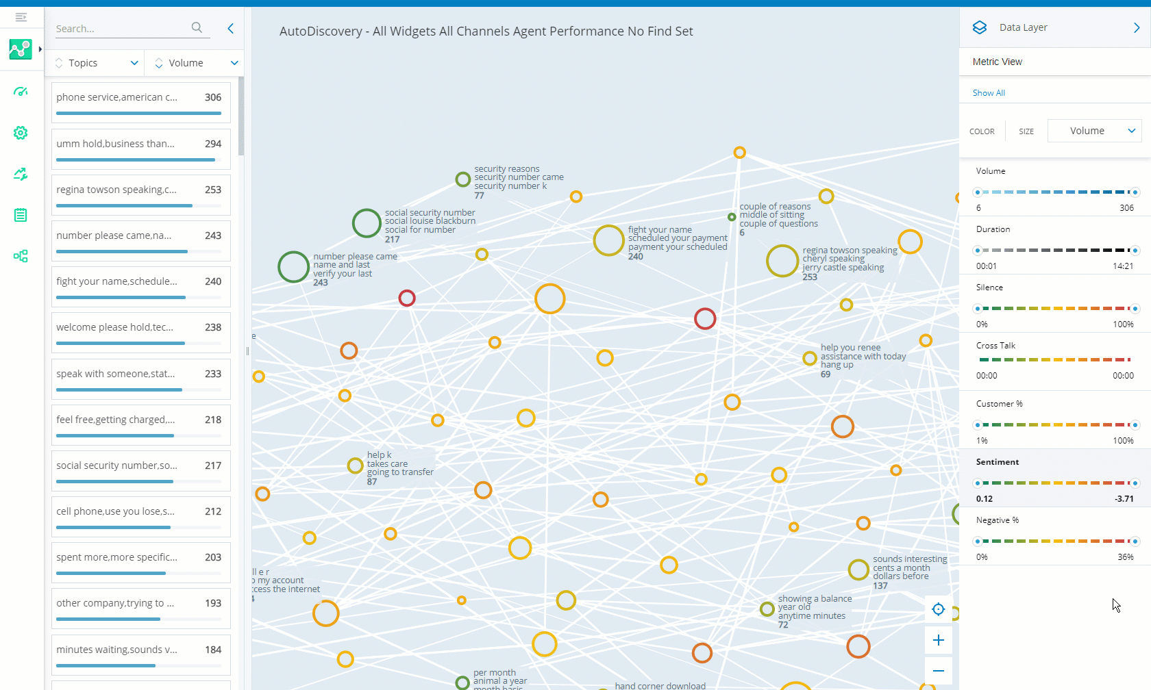
Filter Using the Data Layer
You can filter the topics in the dataset using one or more metrics in the Data Layer panel. Metric sliders allow you to focus on more specific metric results. The data displayed on the map and the Statistics panel will change as you make adjustments in the Data Layer panel. Note that the initial view of the map is set to the Volume metric.
Clarissa Dalloway is a contact center administrator at Classics Inc. She wants to see if there is a connection between customer satisfaction and how long customers spend on the phone with agents. She opens the Data Layer panel in AutoDiscovery and selects the Sentiment metric. She moves the metric slider to the right to only see results with negative sentiments. Next, she selects Duration from the Size drop-down. The color of the circles on the map are orange and red to show topics associated with negative sentiment. The size of the circles show her how long calls lasted. The bigger the circle, the longer the call length. Now she can look at specific topics and interactions to find out more.
-
Click the app selector
 and select Analytics.
 -
Click AutoDiscovery.
-
Click
 to open the Data Layer panel.
 -
Select one or more metrics you would like to use. The topics are shown in a gradient of the metric colors on the map. You can use the metric sliders to focus on more specific results for each metric type. As you move the slider, topics are filtered on the map and in the Statistics panel. Topics that do not match the filter move into the background on the map.
 Learn more about fields in this step
metric
description
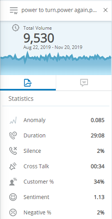
Volume Total number of calls using the selected topic or phrase. The Statistics panel presents a graph with the volume data for the selected time period. You can click on points in the graph to see the volume per day. Volume is represented by circles ranging from light to dark blue on the map. The darker the shade of the blue, the higher the volume of calls for that topic.
Duration Length of a call between an agent and a customer. This can highlight specific issues that agents may find difficult to deal with or solve. Duration is represented by circles ranging from light to dark gray on the map. The darker the shade of gray, the longer the duration of calls.
Anomaly
Instances where there is an unusual trend in one of the metrics. There are likely unexpected changes or spikes in the data. This can help you to identify and resolve problems. Anomalies are represented by circles ranging from light to dark purple on the map. The darker the shade of purple, the higher the anomaly score.
Silence Periods of silence where there is no conversation between customer and agent. This may indicate the agent is struggling to deal with the problem or is unsure how to proceed. Circles on the map will display in a gradient of shades of green, yellow, orange, and red. Dark green indicates a low percentage of silence. Red indicates a high percentage of silence. Colors ranging in between indicate intermediate percentages of silence. Cross Talk Periods where both customer and agent are speaking at the same time. Cross-talk may indicate conflict between customer and agent, or it can signify noncompliance of company policy regarding customer contact etiquette. Circles on the map will display in a gradient of shades of green, yellow, orange, and red. Dark green indicates where there were short periods of cross talk. Red indicates long periods of cross talk. Colors ranging in between indicate intermediate amounts of cross-talk. Customer % Percentage of time the customer spoke during the call. Circles on the map will display in a gradient of shades of green, yellow, orange, and red. Dark green indicates that customers spoke for a small percentage of calls. Red indicates that customers spoke more during calls. Colors ranging in between indicate that the customer spoke for an intermediate percentage of the call. Sentiment Measures customer satisfaction and sentiment over the entire call. Sentiment is measured using AI and machine learning technology. Circles on the map will display in a gradient of shades of green, yellow, orange, and red. Dark green indicates positive sentiment. Red indicates negative sentiment. Colors ranging in between indicate neutral or mixed sentiments.
Negative % Measures the percentage of calls where sentiment is below a certain threshold. This threshold signifies the difference between customer satisfaction and negative sentiment. Circles on the map will display in a gradient of shades of green, yellow, orange, and red. Dark green indicates low negative sentiment. Red indicates high negative sentiment. Colors ranging in between indicate intermediate negative sentiment.
-
To focus on only one metric, click the Size drop-down and select Same as color. The circle size and color will both relate to the selected metric.
-
To focus on more than one metric at a time, click the Size drop-down and select the metric you would like the circle size to represent on the map. The color of circles on the map will reflect the selections you made with the metric sliders. The size of circles will illustrate the prevalence of the metric you chose in the drop-down.
-
You can identify a topic you want to investigate further and click ![]() to drill down to see the interactions for the topic.
to drill down to see the interactions for the topic.
You can click Show all in the Data Layer panel to reset the map.
Filter Using the Statistics Panel
The Statistics panel lists all the topics and phrases within the dataset. You can search for specific topics or phrases using the search bar or filter by metric.
- Click the app selector and select Analytics.
-
Go to AutoDiscovery.
-
Click the arrow to the left to open the Statistics panel.
-
Click the Topics drop-down to view either Topics or Phrases. You can click the arrows to the left to sort the list in alphabetical order.
-
Select a metric from the drop-down. You can click the arrows to the left to sort the list in ascending or descending order.
Learn more about fields in this step
metric
description
Volume Total number of calls using the selected topic or phrase. The Statistics panel presents a graph with the volume data for the selected time period. You can click on points in the graph to see the volume per day. Volume is represented by circles ranging from light to dark blue on the map. The darker the shade of the blue, the higher the volume of calls for that topic.
Duration Length of a call between an agent and a customer. This can highlight specific issues that agents may find difficult to deal with or solve. Duration is represented by circles ranging from light to dark gray on the map. The darker the shade of gray, the longer the duration of calls.
Anomaly
Instances where there is an unusual trend in one of the metrics. There are likely unexpected changes or spikes in the data. This can help you to identify and resolve problems. Anomalies are represented by circles ranging from light to dark purple on the map. The darker the shade of purple, the higher the anomaly score.
Silence Periods of silence where there is no conversation between customer and agent. This may indicate the agent is struggling to deal with the problem or is unsure how to proceed. Circles on the map will display in a gradient of shades of green, yellow, orange, and red. Dark green indicates a low percentage of silence. Red indicates a high percentage of silence. Colors ranging in between indicate intermediate percentages of silence. Cross Talk Periods where both customer and agent are speaking at the same time. Cross-talk may indicate conflict between customer and agent, or it can signify noncompliance of company policy regarding customer contact etiquette. Circles on the map will display in a gradient of shades of green, yellow, orange, and red. Dark green indicates where there were short periods of cross talk. Red indicates long periods of cross talk. Colors ranging in between indicate intermediate amounts of cross-talk. Customer % Percentage of time the customer spoke during the call. Circles on the map will display in a gradient of shades of green, yellow, orange, and red. Dark green indicates that customers spoke for a small percentage of calls. Red indicates that customers spoke more during calls. Colors ranging in between indicate that the customer spoke for an intermediate percentage of the call. Sentiment Measures customer satisfaction and sentiment over the entire call. Sentiment is measured using AI and machine learning technology. Circles on the map will display in a gradient of shades of green, yellow, orange, and red. Dark green indicates positive sentiment. Red indicates negative sentiment. Colors ranging in between indicate neutral or mixed sentiments.
Negative % Measures the percentage of calls where sentiment is below a certain threshold. This threshold signifies the difference between customer satisfaction and negative sentiment. Circles on the map will display in a gradient of shades of green, yellow, orange, and red. Dark green indicates low negative sentiment. Red indicates high negative sentiment. Colors ranging in between indicate intermediate negative sentiment.
-
To focus on a specific topic or phrase, enter it in the search bar or select one from the list in the Statistics panel. The statistics for each of the metrics displays for the topic or phrase you selected.
-
To view all the phrases within a topic click
 .
. -
Click the phrase you would like to view. The map zooms in and the panel displays statistics for that phrase.
You can identify a topic you want to investigate further and click ![]() to drill down to see the interactions for the topic.
to drill down to see the interactions for the topic.
Investigate Anomalies and Trends
AutoDiscovery identifies unusual occurrences in your dataset. Anomalies show changes in trends over time. This highlights topics and phrases that may need your attention.
Classics Inc. is offering customers a new membership rewards program. The details about the membership on the Classics Inc. website are unclear, so they are receiving an increased amount of calls about it. Anomalies in AutoDiscovery display common topics and phrases related to the rewards program. Analyzing these topics and phrases can help Classics Inc. identify how to make their website more informative and improve customer satisfaction.
Identify Anomalies with the Statistics Panel
-
Open the Statistics panel.
-
Select either Topics or Phrases from the drop-down.
-
Select Anomalies from the metric drop-down.
-
Sort the list in descending order, from highest to lowest anomaly score.
-
Select a topic or phrase to view statistics and the trend graph.
-
Move your mouse over the graph to view details about the peaks.
-
If you selected a topic, you can drill down further and do the same to focus on the topics' phrases.
Identify Anomalies with the Data Layer
-
Open the Data Layer panel.
-
Select the Anomalies metric.
-
Move the metric slider to the right to see to focus on areas with high anomalies.
-
To only see results related to anomalies, click the Size drop-down and select Same as color.
-
To identify other factors contributing to the anomaly, try selecting other metrics.
-
Select a specific topic or phrase in the topic to focus on it.
View Interactions
After finding a topic or phrase you want to focus on, you can click ![]() to view individual interactions.
to view individual interactions.
Once you open the Interactions Widget you can:
-
Sort the columns in ascending or descending order.
-
Select an interaction to see the corresponding transcript and listen to the call. Keywords are highlighted in the transcript.
-
Export data to a CSV file.
Add Phrases to a Category
AutoDiscovery can help you identify new categories![]() Data groups that Interaction Analytics (CXone) uses for parsed call transcript data. They make it easier to find trends. you may want to create or phrases you may want to add to an existing category.
Data groups that Interaction Analytics (CXone) uses for parsed call transcript data. They make it easier to find trends. you may want to create or phrases you may want to add to an existing category.
-
In AutoDiscovery, select the topic or phrase you want to add to a category and click
 .
. -
In the Select Location window, expand the Categories list and select a folder to create a new category, or select an existing category to add the phrase to it and click Save as Category.
-
Use the Rules Editor to make any desired changes to the category rules
Criteria to determine the category to place a transcript in. Contain keywords or phrases a transcript must include or exclude.. This allows you to select who you want rules to apply to such as the agent, client, or neither. You can also modify existing rule sets by adding keywords, phrases, sentiment, metrics, company profile Page in Interaction Analytics (CXone) where you can create custom entities. entities, or other elements to a category.If you make any updates in the category editor, the dataset will be different from what was previewed in your workspace.
Once you have made your changes, you can navigate back to AutoDiscovery using the link at the top on the Rules Editor window.
Save a Search
You can select saved searches from the drop-down and quickly view results without reapplying filters. Saved searches can be public or private. Public searches are visible to all users. Private searches are only visible to the user that created them or users with the Admin permission.
To manage saved searches, click more options  > Saved Searches in the top-right corner. Here you can view details, copy, and delete saved searches. You need the Admin permission to delete searches created by other users.
Use clear names and unique colors to quickly find searches and tell them apart. Develop a consistent naming convention to make this easier.
- Click the app selector and select Analytics.
- Go to AutoDiscovery.
-
To save a search, configure the search settings and filters for the data you would like to view. Then, enter your search.
-
When you are finished, click the save icon
 in the top right corner.
 -
In the New Search field, enter a name for your search. It may be helpful to include numbers or special characters in the name, but not all characters are supported. For example, you could use the names Kansas Team > 30 seconds; Team Emerald City or Team Munchkinland 'Escalations' [with transfer].
You will get an error message if you use the following characters to name a saved search: a comma, a period, #, ? , $, %, or ( ).
Supported characters:
- Alphanumeric characters (A-Z, uppercase and lowercase, and 0–9)
- Underscores ( _ )
- Spaces
- Hyphens ( - )
- Colons ( : )
- Semicolons ( ; )
- Double quotes ( " " )
- Single quotes ( ' ' )
- Pipe symbols ( | )
- Less than and greater than symbols ( < > )
- Square brackets ( [ ] )
- Curly brackets ( { } )
-
To select a different color for your search, click the colored box in the New Search field and select another color.
-
Enter a description of your search settings and filters.
-
Enable Public, to make the search visible to other users. Saved searches are private by default.
-
Click Save As. Now your search is available in the drop-down and you can reuse the same search criteria later.
Export AutoDiscovery Data to CSV
- Click Options in the top right corner.
- Click Export
 .
.