

Augmentation Opportunity helps supervisors and operations leaders identify where agent augmentation can reduce average segment![]() A stage in the interaction, such as when a call is transferred to another agent, or agents speak internally to consult. duration. It highlights opportunities across the main improvement areas so teams can prioritize coaching, real-time guidance, and process or knowledge improvements. Augmentation Opportunity analyses interaction
A stage in the interaction, such as when a call is transferred to another agent, or agents speak internally to consult. duration. It highlights opportunities across the main improvement areas so teams can prioritize coaching, real-time guidance, and process or knowledge improvements. Augmentation Opportunity analyses interaction![]() The full conversation with an agent through a channel. For example, an interaction can be a voice call, email, chat, or social media conversation. to show:
The full conversation with an agent through a channel. For example, an interaction can be a voice call, email, chat, or social media conversation. to show:
-
Where agent coaching can help outlier agents perform closer to their peers.
-
Where mid-tier agents can benefit from Copilot (Live Agent Assist).
-
How these improvements contribute to your overall duration reduction target.
Augmentation Opportunity is designed to help you understand where agents can handle interactions![]() The full conversation with an agent through a channel. For example, an interaction can be a voice call, email, chat, or social media conversation. more efficiently and consistently. The dashboard describes high-level summary widgets with detailed drill-down views so you can move from overall opportunity to specific actions.
The full conversation with an agent through a channel. For example, an interaction can be a voice call, email, chat, or social media conversation. more efficiently and consistently. The dashboard describes high-level summary widgets with detailed drill-down views so you can move from overall opportunity to specific actions.
Accessing Augmentation Opportunity
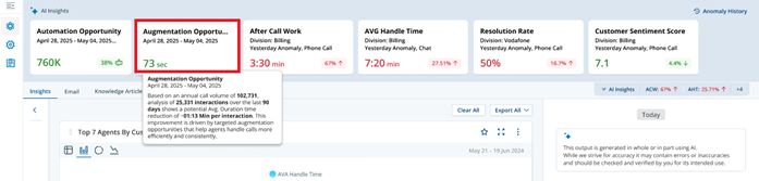
To access the Augmentation Opportunity dashboard, go to the AI Insights section and locate the Augmentation Opportunity card. Click the Augmentation Opportunity card to open the dashboard and view detailed insights into where and how agent efficiency can be improved, particularly to reduce average segment duration.
-
Access to the User tab of the Settings page is available only if you have selected the Enable Automated Insights for Users checkbox in the Tenant tab of the Settings page.
-
The Augmentation Opportunity card and dashboard are visible only if you have selected the Enable Augmentation Opportunity checkbox in the User tab of the Settings page. For details, refer to the Settings topic.
Augmentation Opportunity Dashboard
The dashboard is populated based on the Analyze Period selected in the User tab of the Settings page. When you click the Augmentation Opportunity card, the system uses this date range to display insights. For all other filters, such as Team, Skills, Channel, Direction, and Category, the application defaults to All unless you apply specific selections. For details on configuring the Analyze Period, refer to the Settings topic.
You can further refine the data by applying filters such as Team, Skills, Channel, Direction, and Category within the selected Analyze Period. If the analysis period is shorter than one year, the system extrapolates the data to estimate annual augmentation potential.
In the Augmentation Opportunity dashboard, you can:
Filter the Augmentation Opportunity Dashboard
You can filter the Augmentation Opportunity dashboard to view data for a specific time range, category, team, skills, channel, or direction. Use filters to narrow down insights and focus on relevant augmentation opportunities.
-
At the top of the dashboard, select the Date Range field. Choose one of the preset options:
-
Last 30 Days
-
Last 60 Days
-
Last 90 Days
-
Previous Month
-
Last X Days
-
Today
-
Or select a custom range using the calendar. For example, click 23 September 2025 as the start date and 21 December 2025 as the end date.
-
-
You can also select filters for Team, Skills, Channel, Direction, and Category. This selection is optional.
-
Team: Choose one or more teams.
-
Skills: Select specific skills relevant to the interactions.
-
Channel: Filter by voice or chat channels.
-
Direction: Choose inbound or outbound directions.
-
Category: Filter by high‑level intent categories to quickly focus on broader themes such as Billing or Account Management.
-
-
Click Apply to refresh the dashboard with your selected filters.
Use narrow filters, for example, one team and one channel when you need precise augmentation opportunities for a pilot.
-
To remove all filters and return to the default view, click Clear.
Review Analyze Period
The Analyze Period panel shows key performance indicators (KPIs) based on the filters you select, such as Date Range, Team, Skills, Channel, Direction, and Category. These KPIs summarize the interaction included in the analysis.
Reviewing these KPIs provides a quick snapshot of scale, performance, and opportunity volume. It helps you understand the dataset, compare Avg. Duration and Sentiment, and assess potential optimization impact.
The panel includes the following KPIs:
-
Total Interactions – The total number of customer interactions included in the analysis. This represents the dataset used to identify Avg. Duration outliers and opportunities.
-
Avg. Duration (MM:SS) – The average handle time across all interactions included in the analysis. This is the baseline metric used to identify interactions that take longer than expected.
-
Avg. Sentiment – Indicates the overall customer sentiment score during the analyzed period, helping correlate efficiency with experience quality.
-
Intents Identified – The number of distinct customer intents detected. This helps understand the variety of issues driving the interactions.
-
Actions Identified – Represents the number of agent actions captured during interactions. Actions include tasks such as updating records, processing refunds, or providing account details.
-
Number of Agents – Total agents included in the analysis, enabling performance comparison and outlier detection.
Assess Yearly Impact Projection with AI insight
The AI Insights card provides an estimate of the potential impact of augmentation over one year. It uses interaction data from the selected analysis period and extrapolates the results to identify opportunities to reduce Avg. Duration and calculate the associated cost savings and Return on Investment (ROI).
The purpose of the AI Insights card is to help you understand the business value of augmentation. It provides a clear, quantitative view of potential efficiency gains, so you can prioritize coaching, knowledge enhancements, workflow improvements, and Copilot guidance.
The AI Insights card displays two key elements:
-
Avg. Duration Reduction: The estimated reduction in Average Handle Time per interaction, based on identified opportunities across agent performance and mid-tier improvements.
-
Potential ROI (USD): The projected cost savings achieved by reducing Avg. Duration across the analysed interactions.
You can use the card as follows:
-
Apply filters for Date Range, Categories, Team, Skills, Channel, and Direction.
-
Review the Avg. Duration Reduction opportunity and Potential ROI to:
-
Identify high-impact optimization opportunities. For example, let’s say the AI Insights card shows:
-
Avg. Duration Reduction: 73 seconds
-
Potential ROI: $19,928
This means that, on average, each interaction could be reduced by 73 seconds if the identified improvements are implemented. Based on the analyzed interaction data, this projected reduction is extrapolated to show an estimated savings of nearly $20K over one year.
How to use this insight
Identify high-impact optimization opportunities: If most of the 73-second reduction comes from a specific topic (e.g., billing issues), that area becomes a priority for improvement.
Prioritize coaching and process improvements: If a large portion of the savings is driven by agent performance (e.g., 32 seconds), you can focus on coaching agents. If another portion comes from mid-tier improvement (e.g., 36 seconds), you can focus on improving workflows, updating knowledge content, and using Copilot guidance to support agents in real time.
Build a data-driven case for operational enhancements: Instead of guessing, you can say: “By improving these areas, we can save ~73 seconds per call and ~$20K overall,” making it easier to justify investments in training, tools, or process changes.
-
-
Prioritize coaching and process improvements
-
Build a data-driven case for operational enhancements
-
-
Use the narrative insight to understand key drivers of inefficiency and communicate expected savings and impact to the stakeholders.
How to Use Augmentation Charts and Widgets for Prioritization
The Augmentation dashboard brings together multiple charts and tables to help you identify, evaluate, and prioritize the most impactful opportunities to reduce Avg. Duration. By reviewing these components in a structured sequence, you can move from high-level insights to targeted, data-driven actions.
You should begin with the Overall Avg. Duration Reduction Target chart, which provides a clear view of where the greatest improvement potential lies. It breaks down total duration reduction opportunity into key drivers, such as Agent Performance and Mid-Tier Improvements, so you can quickly understand whether inefficiencies are primarily driven by agent performance or by process and knowledge gaps. The relative size of each part of the donut chart helps you determine where to focus first, whether that is coaching and standardization or optimizing workflows and enabling Copilot guidance.
Next, the Agent Performance Variance section helps you analyse inefficiencies related to inconsistent agent performance. The variance chart highlights subtopics where there is a significant gap between outlier and non-outlier agents, indicating strong coaching opportunities. The bubble chart extends this by identifying which specific agents have the highest potential for improvement based on their current duration and reduction opportunity. The table then provides detailed agent-level data, enabling you to validate these insights, compare performance within subtopics, and take targeted coaching actions. Together, this section helps you understand where inconsistencies exist, who needs attention, and what level of improvement can be expected.
You can then move to the Mid-Tier Improvement Opportunity section to evaluate how process, workflow, and Copilot-driven enhancements can reduce Avg. Duration at scale. The decile shift chart shows how interaction durations improve across performance segments when Copilot is applied, with the most noticeable gains typically seen in mid-tier deciles. The bubble chart builds on this by identifying which subtopics deliver the highest impact by combining per-interaction time savings with interaction volume. The table complements these visuals by providing detailed subtopic-level metrics, allowing you to validate opportunities, compare impact across subtopics, and prioritize implementation decisions.
To prioritize effectively, you should combine insights from all these components. Start by identifying the primary driver of inefficiency using the duration reduction chart, then validate whether specific subtopics and agents are contributing to the issue using the variance section. Finally, use the mid-tier section to quantify the potential gains from process and Copilot-driven improvements.
For example, if the duration breakdown shows that mid-tier improvements contribute the most, the variance chart highlights inconsistency in billing-related subtopics, and the mid-tier bubble chart shows that billing has both high volume and strong time-saving potential, you can prioritize improving billing workflows and knowledge while also supporting agents with targeted coaching.
By using these charts and tables together, you can focus on the highest-impact opportunities and ensure that your efforts lead to meaningful improvements in efficiency, consistency, and overall performance.
Review Overall Avg. Duration Reduction Target
The Overall Avg. Duration Reduction Target chart helps you understand how different improvement areas contribute to reducing Avg. Duration, so you can prioritize the most impactful optimization efforts. The chart provides a clear visual breakdown of where time savings can be achieved across agent performance and mid-tier improvements. The donut chart displays the contribution of each improvement area toward the total Avg. Duration reduction.
-
The chart contains two segments:
-
Agent Performance: Represented in purple, this segment shows time savings driven by improvements in agent performance, such as coaching, training, and consistency.
-
Mid-Tier Improvement: Represented in light blue, this segment shows time savings driven by process, workflow, or knowledge enhancements, such as better knowledge base content or Copilot guidance.
-
-
Each segment displays:
-
Theme name
-
Avg. Duration reduction value
-
Percentage share of total reduction
-
Segment size is proportional to its contribution to the overall duration reduction target.
-
-
Duration values represent the reduction in Avg. Duration per interaction. They are displayed in seconds when less than 60 seconds (e.g., 32 sec), and in MM: SS format when greater than or equal to 60 seconds.
-
The total value in the centre of the donut represents the combined Avg. Duration reduction opportunity across all improvement areas.
-
The chart updates dynamically based on selected filters such as Date Range, Team, Skills, Channel, Direction, and Category.
How to Interpret the Chart
-
Larger segment: Indicates a greater contribution to reducing Avg. Duration and should be prioritized.
-
Agent Performance segment is larger: Focus on coaching, training, and improving agent consistency.
-
Mid-Tier Improvement segment is larger: Focus on optimizing workflows, enhancing knowledge content, or enabling real-time guidance.
-
Segments are similar in size: Both agent performance and process improvements contribute equally, and a balanced approach is recommended.
This chart helps you quickly identify where the biggest efficiency opportunities exist and guides you in prioritizing the most impactful actions.
Agent Performance Variance
The Agent Performance Variance section helps supervisors and operations leaders identify where differences in agent performance are driving higher Avg. Duration. It highlights inconsistencies in how agents handle the same subtopics, quantifies coaching opportunities and estimates how much duration can be reduced by bringing lower-performing agents closer to the team average.
This section provides a structured workflow to move from insight to action.
You start with the Agent Performance Variance chart, which highlights subtopics where there is a large gap between high- and low-performing agents. These gaps indicate where inconsistent handling is increasing Avg. Duration and where coaching can have the greatest impact.
Next, the Coaching Opportunities by Agent (bubble chart) helps you drill down to identify which agents are contributing to the variance and where coaching is likely to have the greatest impact.
This is followed by the Coaching Opportunities table, which provides the detailed data behind the bubble chart. Use the table to compare agent performance within each subtopic, review sentiment, and prioritize coaching actions with more precision.
Agent Performance Variance Chart
This chart compares agent performance within each subtopic to highlight where inconsistencies are driving higher duration.
Intents![]() The meaning or purpose behind what a contact says/types; what the contact wants to communicate or accomplish. are organized into three levels: category, topic, and subtopic. A subtopic represents the most specific reason for which a customer contacted the business—for example, “Pending payment” or “Account closure.” These subtopics are grouped into broader topics, such as “Payment Issues,” and further classified under a high-level category such as “Billing.”
The meaning or purpose behind what a contact says/types; what the contact wants to communicate or accomplish. are organized into three levels: category, topic, and subtopic. A subtopic represents the most specific reason for which a customer contacted the business—for example, “Pending payment” or “Account closure.” These subtopics are grouped into broader topics, such as “Payment Issues,” and further classified under a high-level category such as “Billing.”
-
X-axis: Displays customer subtopics. These subtopics are sorted in descending order of Avg. Duration reduction opportunity, with the highest-impact opportunities shown first. Only the top 10 subtopics are displayed, and any subtopics with zero interaction volume are excluded from the chart. For example, Suppose the chart shows the following subtopics:
-
Inquiring About Overcharges → 1 min 30 sec potential reduction
-
Having Internet Issues → 1 min 10 sec potential reduction
-
Making a Payment → 45 sec potential reduction
-
In this case, “Inquiring About Overcharges” will appear first on the left because it has the highest Avg. Duration reduction, followed by “Having Internet Issues,” and then “Making a Payment.”
-
-
The chart uses two Y-axes to present complementary information. The left Y-axis shows the Avg. interaction duration in MM:SS format, helping you understand how long interactions currently take. The right Y-axis shows the Avg. Duration reduction opportunity in MM:SS format, representing the potential time savings if performance is improved.
-
The chart includes two sets of bars to compare agent performance. The purple bars represent the Avg. Duration for outlier agents, who are the higher-duration, lower-performing group. The teal bars represent the Avg. Duration for non-outlier agents, reflecting the performance of the remaining agents. The difference between these bars highlights the level of performance variability within each subtopic.
-
A black line overlays the chart to show the estimated Avg. Duration reduction opportunity for each subtopic. This indicates how much time can potentially be saved if outlier agents improve their performance to match the average.
-
The chart updates dynamically based on selected filters such as Date Range, Team, Skills, Channel, Direction, and Category.
-
In all the graphs, click Maximize
 to view the graph in full screen.
How to Interpret the Chart
-
Large gap between purple and teal bars: Indicates high performance variability within a subtopic and strong coaching opportunity.
-
High reduction line value: Indicates subtopics where coaching can significantly reduce Avg. Duration.
-
Subtopics at the left (top-ranked): Represent the highest impact opportunities, as they are sorted by potential duration reduction.
-
Smaller gaps and lower reduction values: Indicate more consistent performance with lower coaching impact.
This chart helps you understand how much duration can be reduced by improving low-performing agents toward the team average.
Coaching Opportunities by Agent (Bubble Chart)
The Coaching Opportunities by Agent (Bubble Chart) is a direct extension of the Agent Performance Variance chart because it takes insights identified at the subtopic level and translates them into agent-level coaching actions.
The variance chart first helps you understand where performance gaps exist by highlighting subtopics where outlier agents take significantly longer than others. These gaps indicate opportunities where coaching can reduce Avg. Duration. The bubble chart builds on this by showing which agents are contributing to those gaps and where coaching is likely to have the greatest impact.
Each bubble in the chart represents an individual agent, allowing you to move from identifying problem areas to targeting specific agents.
-
The X-axis represents the Avg. Duration represents the agent’s average segment duration, which is the average time the agent takes to handle interactions in the selected view. It is displayed in MM:SS format.
-
This metric helps you understand how efficiently an agent is handling interactions. Agents farther to the right have longer Avg. Duration, which may indicate opportunities for coaching.
-
The Y-axis represents the agent’s Avg. Duration Reduction refers to the Avg. Duration reduction opportunity. This is the estimated time that can be saved per interaction if the agent improves performance toward the average of comparable agents. It is displayed in MM:SS format.
-
This metric helps you identify where coaching can have the greatest improvement effect. Agents higher on the chart have greater reduction opportunity.
-
The size of each bubble represents the Coaching impact on overall avg. duration, measured as the overall Avg. Duration reduction impact. Larger bubbles indicate agents where coaching can deliver greater overall value. In other words, the larger the bubble, the more that agent’s coaching opportunity would help reduce the overall Avg. Duration across all interactions if addressed.
-
The colour of each bubble reflects the agent’s sentiment performance ranking, based on the sentiment of interactions they handled. A legend is provided to show the range from lower-performing agents (0–20%) to higher-performing agents (80–100%).
-
The legend also displays the minimum and maximum values for the agent coaching opportunity shown by bubble size. This helps you understand the scale of the impact represented in the chart.
How to Interpret the Chart
-
Large bubbles in the upper-right area: Agents with high duration and high reduction potential—these are the highest-priority coaching candidates. These intents are strong candidates for automation because most interactions can be automated.
-
Large bubbles with moderate duration: Agents who may not be the slowest but still offer significant improvement potential.
-
Smaller bubbles: Agents with lower impact, where coaching may yield limited gains.
-
Bubble colour insights:
-
Lower sentiment scores may indicate both efficiency and quality issues.
-
Higher sentiment with high duration may indicate good experience but inefficient handling.
-
Coaching Opportunities Table
The Coaching Opportunities table provides detailed, agent-level insights that help you take action based on findings from both the Agent Performance Variance chart and the Coaching Opportunities by Agent (Bubble Chart). It complements these charts by connecting where the issue exists and who is responsible with how to act.
From the variance chart, you identify high-impact subtopics with performance variability, and from the bubble chart, you identify agents with high duration and high reduction potential. The table then provides the detailed breakdown needed to take targeted action by showing how each agent is performing within specific subtopics.
The table consists of following columns:
| Column Name | Description |
|---|---|
| Agent Name | Displays the first and last name of the agent, allowing you to identify the specific individual associated with the performance data. |
|
Sub Topic |
Represents the customer subtopic, also described as the Level-3 intent, for which the agent’s performance is being evaluated. |
| Coaching Impact On Overall Avg. Duration | Indicates how much this agent’s coaching opportunity would reduce the overall Avg. Duration across all interactions if addressed. This represents the overall coaching impact for the agent and helps you prioritize improvement efforts. Values are displayed in MM:SS format. |
| Average Duration Reduction | The estimated time that can be reduced per interaction if the agent improves performance toward the subtopic average. Values are displayed in MM:SS format. |
| Agent Avg. Duration | The Avg. Duration of the agent’s interactions for the selected subtopic, displayed in MM:SS format. This helps assess the agent’s current efficiency. |
| Sub Topic Avg. Duration | The Avg. Duration across all agents for the selected subtopic, displayed in MM:SS format. This serves as a benchmark for comparison. |
| Volume | The total number of segments handled by the agent for that subtopic. Higher volume indicates greater potential impact from improvement. |
| Agent Sentiment | The average customer sentiment (CSAT |
| Sub Topic Sentiment | The average customer sentiment (CSAT |
| Sentiment Gap | The difference between Agent Sentiment and Sub Topic Sentiment (Agent Sentiment – Sub Topic Sentiment). This helps identify whether the agent is performing above or below the subtopic average in terms of customer experience. |
The table is sorted in descending order by Agent Coaching Overall Avg. Duration Reduction, so agents with the highest improvement potential appear first. All columns support sorting, allowing you to reorder the table based on different metrics for deeper analysis.
How to Use the Table
The table enables you to move from insight to action by providing the context needed to validate and prioritize coaching decisions.
-
Identify agents contributing to high duration within specific subtopics.
-
Compare agent Avg. Duration against subtopic average to quantify performance gaps.
-
Use the coaching opportunity score to prioritize agents with the highest potential impact.
-
Review interaction volume to understand the scale of impact.
-
Evaluate sentiment and sentiment gap to ensure improvements maintain or enhance customer experience.
Mid-Tier Improvement Opportunity
The Mid-Tier Improvement Opportunity section helps you identify ways to reduce Avg. Duration through process, workflow, and Copilot-assisted improvements. It highlights how real-time guidance, such as Live Agent Assist, improves efficiency—especially for mid-performing interaction segments.
The charts and table in this section are designed to work together as a guided workflow from Insights to Actions.
You start with the Mid-Tier Improvement Opportunity (Decile Shift Chart), which shows how Avg. Duration improves across interaction deciles when Copilot is applied. This helps you understand where improvements occur, particularly in mid-tier segments (Deciles 3–8), where interactions typically improve by approximately one decile.
Next, the High-Impact Copilot Targets (Bubble Chart) helps you identify which subtopics to prioritize. It combines per-call time savings with interaction volume to highlight areas that will deliver the greatest overall impact.
This is followed by the High-Impact Copilot Targets table which provides the detailed breakdown needed to take action. It allows you to validate insights from the charts, compare subtopics side-by-side, and make informed decisions about where to focus implementation efforts.
Mid-Tier Improvement Opportunity (Decile Shift Chart)
The Mid-Tier Improvement Opportunity chart displays Avg. Duration before and after Copilot across agent performance deciles. It highlights how interactions improve when mid-tier support such as Live Agent Assist (Copilot) is applied.
The chart focuses primarily on mid-tier deciles (typically Decile 3–8), where the greatest improvements are observed.
-
The X-axis displays deciles (1–10), which represent groups of interactions ranked based on duration. A decile divides interactions into 10 equal groups, where each group represents 10% of interactions within a subtopic. In this model:
-
Deciles 1–2 represent the fastest interactions
-
Deciles 3–8 represent the mid-tier interactions
-
Deciles 9–10 represent the slowest and most complex interactions
The chart focuses primarily on the mid-tier portion (Deciles 3–8), where the greatest opportunity for improvement exists.
-
-
The Y-axis displays the Avg. Duration (MM:SS), showing the average time taken to handle interactions within each decile. This allows you to compare how interaction duration changes before and after applying Copilot.
-
The chart uses two bars for each decile to show the impact of Copilot:
-
The blue bars represent the Avg. Duration Before, indicating baseline performance.
-
The green bars represent the Avg. Duration After, showing the improved handling time when Copilot guidance is applied.
-
The difference between the blue and green bars highlights the reduction in handling time achieved through mid-tier improvements.
-
-
Above the chart, summary metrics provide an overall view of the impact:
-
Copilot Avg. Duration Saved shows the average time saved per interaction across all deciles.
-
Avg. Duration Before represents the baseline average handling time prior to applying Copilot.
-
Avg. Duration After shows the improved average handling time after Copilot is applied.
-
-
In all the graphs, click Maximize
to view the graph in full screen.
How to Interpret the Chart
-
Mid-tier deciles (3–8): Show the most noticeable improvements, indicating where Copilot has the greatest impact.
-
Shift between blue and green bars: Shows how interactions improve with a one decile shift to the left, moving them closer to better-performing interactions.
-
Higher deciles: Still benefit from improvement, but gains may vary based on complexity.
This chart helps you understand how performance shifts across interaction segments when Copilot is applied.
High-Impact Copilot Targets (Bubble Chart)
The High-Impact Copilot Targets chart helps you identify which interaction subtopics will deliver the greatest impact from Copilot-driven improvements. It builds on the insights from the Mid-Tier Improvement Opportunity (Decile Shift Chart) by translating overall performance improvements into specific, actionable priorities.
While the decile chart shows how interaction durations improve across performance segments, this chart helps you prioritize where to apply mid-tier improvements by combining time savings per interaction with annual interaction volume. It enables you to focus on subtopics that will deliver the greatest overall impact, ensuring that Copilot implementation is both targeted and effective.
-
Each bubble in the chart represents a Intent (subtopic), also described as a Level-3 intent. This allows you to compare the expected Copilot impact across different types of interactions.
-
The X-axis displays the Copilot Avg. Duration Saved (MM:SS) for each subtopic, representing the average amount of time Copilot can save per interaction. Subtopics farther to the right indicate greater time savings for each interaction.
-
The Y-axis displays the Annual Interactions, which indicates the projected annual interaction volume for each subtopic. Subtopics positioned higher on the chart have greater improvement potential.
-
The size of each bubble represents the overall Avg. Duration reduction opportunity impact, which combines the average time saved per interaction with the interaction volume. Larger bubbles indicate subtopics where improvements will result in greater overall time savings at scale.
-
The size of each bubble represents the Copilot Overall Avg. Duration Reduction, which shows the subtopic’s overall contribution to Avg. Duration reduction. Larger bubbles indicate subtopics where Copilot can deliver greater overall impact, while smaller bubbles indicate lower overall impact.
-
The colour of each bubble represents the percentage of Copilot Annual Time Saved (%), showing how much each subtopic contributes to total annual time savings. The colours are categorized into ranges (for example, 0–20% up to 80–100%), helping you quickly identify high-impact areas.
-
A legend is provided to support interpretation of the chart. It displays:
-
The colour ranges corresponding to different percentages of annual time saved
-
The minimum and maximum values for overall impact, helping you understand the scale of bubble sizes
-
-
All values in the chart update dynamically based on the filters selected in the query builder, such as Date Range, Team, Skills, Channel, Direction, and Category ensuring that the insights reflect the specific data set being analysed.
How to Interpret the Chart
-
Bubbles located in the top-right area of the chart represent the highest-impact opportunities. These subtopics combine high average handling time, high potential for duration reduction, and high interaction volume, making them the most valuable areas to prioritize for Copilot implementation.
-
Subtopics positioned further to the right on the X-axis indicate greater Copilot Avg. Duration Saved. These are the subtopics where Copilot is expected to save more time for each interaction.
-
Subtopics positioned higher on the Y-axis indicate greater Annual Interactions. These are the subtopics where even moderate time savings can create significant annual impact because the interactions happen more often.
-
Larger bubbles indicate subtopics with a greater Copilot Overall Avg. Duration Reduction. These are often the best candidates for prioritization because they have a stronger overall effect on reducing the Avg. Duration across all interactions.
-
The colour of each bubble represents the proportion of total annual time savings contributed by that subtopic. Subtopics with higher percentage values (as indicated by the colour scale) contribute more significantly to overall efficiency gains and should be considered higher priority.
High-Impact Copilot Targets – Table
The High-Impact Copilot Targets table provides a detailed, subtopic-level breakdown of Copilot impact. It complements the bubble chart by presenting the same insights with precise numerical values, allowing for deeper analysis and validation.
While the bubble chart helps you visually identify high-impact opportunities, the table provides the exact metrics behind those visualizations, enabling more informed decision-making.
The table acts as the final step in the analysis by connecting insights from both the Decile Shift Chart and the Bubble Chart to actionable data.
-
From the Decile Shift Chart, you understand how performance improves across interaction segments
-
From the Bubble Chart, you identify which subtopics offer the highest impact
-
From the Table, you get the detailed breakdown needed to validate and prioritize those opportunities
The table consists of following columns:
| Column Name | Description |
|---|---|
|
Sub Topic |
The customer subtopic (Level-3 intent) being analyzed. |
| Copilot Overall Avg. Duration Reduction | The total average reduction in handling time for the subtopic when Copilot is applied. This reflects the overall impact across all interactions for that subtopic. |
| Sub Topic Avg. Duration | The current average handling time for the subtopic before applying Copilot, displayed in MM:SS format. |
| Copilot Avg. Duration Saved | The average time saved per interaction when Copilot is applied, displayed in MM:SS format. This represents the efficiency gain per call. |
| Copilot Annual Time Saved (%) | The percentage of total annual time savings contributed by the subtopic. This helps you understand the relative importance of the subtopic in driving overall efficiency gains. |
| Interaction Volume | The total number of interactions for the subtopic. Higher volumes indicate greater potential impact when improvements are applied. |
The table can be sorted by any column, allowing you to analyse data from different perspectives (e.g., highest time savings, highest volume). Values update dynamically based on selected filters such as Date Range, Team, Skills, Channel, Direction, and Category.
If a filter combination returns insufficient data for a decile, the decile may be omitted or shown with an insufficient-data state instead of an empty bar.
How to Use the Table
Use the table to validate the insights from the High-Impact Copilot Targets bubble chart by reviewing the exact numerical values for each subtopic. While the bubble chart provides a visual indication of high-impact opportunities, the table allows you to confirm those insights using detailed metrics such as duration reduction, volume, and percentage of annual time saved.
Next, the table enables you to compare subtopics side-by-side. By viewing multiple metrics together, you can evaluate the relative impact of each subtopic and determine which ones offer the best balance between Copilot efficiency gains and scale.
You can also use the table to identify the most impactful Copilot opportunities by reviewing these key factors:
-
Copilot Avg. Duration Saved per interaction: Helps you understand how much time Copilot can save on each interaction, helping you understand the efficiency improvement for that subtopic.
-
Interaction volume: Indicates how frequently the subtopic occurs, helping you assess the scale of impact.
-
Copilot Annual Time Saved (%): Shows how much each subtopic contributes to overall annual efficiency gains, helping you prioritize higher-value Copilot opportunities.
By combining these factors, you can prioritize subtopics where Copilot can deliver both high efficiency gains and large-scale impact, ensuring that optimization efforts are focused on areas that provide the greatest overall benefit.